Create a Chart from Start to Finish
Charts help you visualize your data in a way that creates maximum impact on your audience. Learn to create a chart and add a trendline.
Create a chart

1. Select data for the chart.
2. Select Insert > Recommended Charts.
3. Select a chart on the Recommended Charts tab, to preview the chart.
Note: You can select the data you want in the chart and press ALT + F1 to create a chart immediately, but it might not be the best chart for the data. If you don’t see a chart you like, select the All Charts tab to see all chart types.
4. Select a chart.
5. Select OK.
Add a trendline
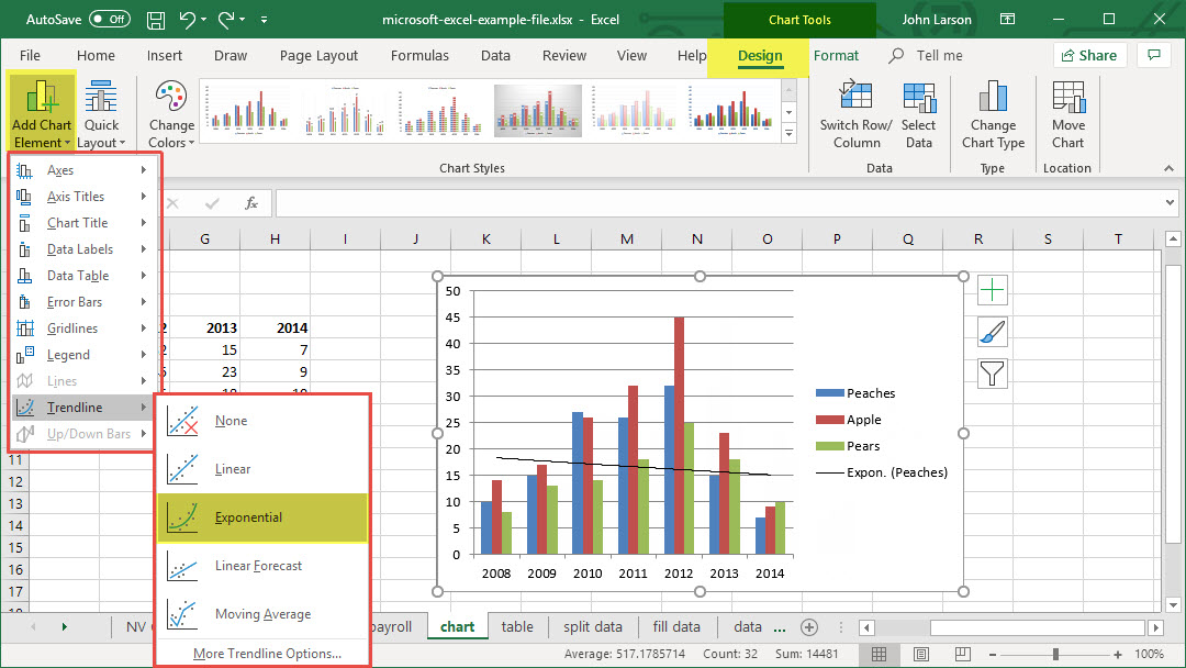
1. Select a chart.
2. Select Design > Add Chart Element.
3. Select Trendline and then select the type of trendline you want, such as Linear, Exponential, Linear Forecast, or Moving Average.
Add or Remove Titles in a Chart
To make a chart easier to understand, you can add chart title and axis titles, to any type of chart. Axis titles are typically available for all axes that can be displayed in a chart, including depth (series) axes in 3-D charts. Some chart types (such as radar charts) have axes, but they cannot display axis titles. You can’t add axis titles to charts that don’t have axes (like pie or doughnut charts).
Add a chart title
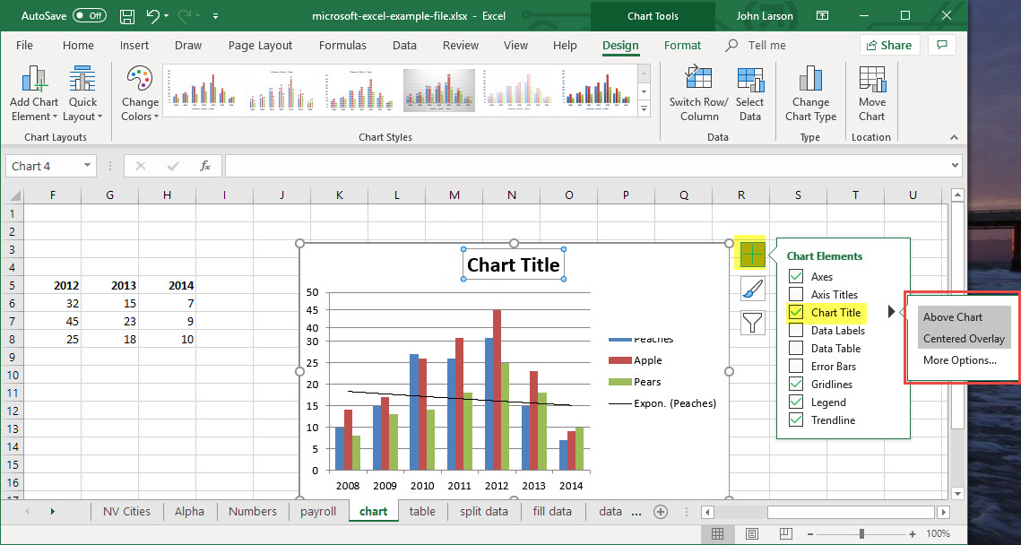
1. In the chart, select the “Chart Title” box and type in a title.
2. Select the plus sign.
3. Select the arrow next to Chart Title.
4. Select Centered Overlay to lay the title over the chart, or More Options for additional choices.
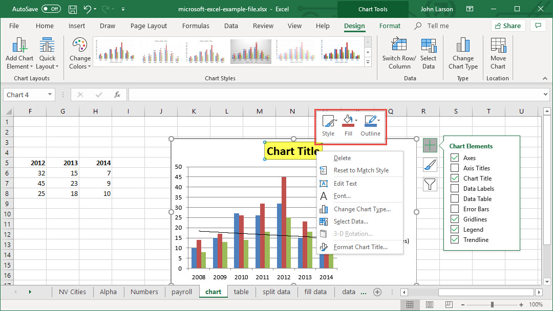
5. Right-click the chart title to format it. with options like Fill or Outline.
Update a chart title
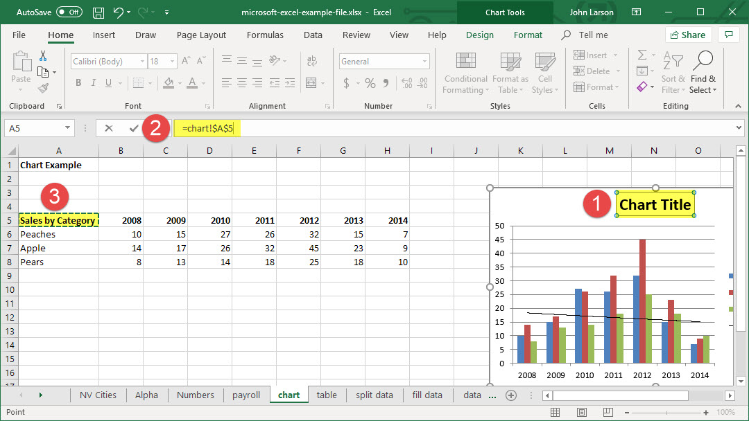
1. Select a chart title.
2. Add an equal sign to the formula bar.
3. Select the cell you want to link any title changes to.
4. Press Enter.
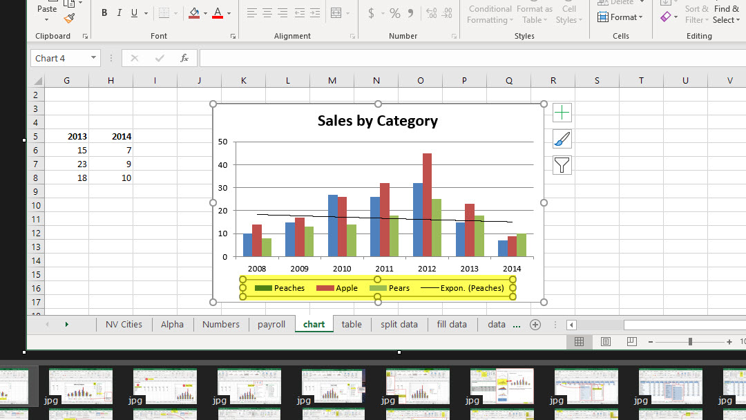
Show or Hide a Chart Legend or Data Table
When you create a chart, the legend appears by default, but you can hide the legend or change its location after you create the chart.
You can also show a data table for a line chart, area chart, column chart, or bar chart. A data table displays the values that are presented in the chart in a grid at the bottom of the chart. A data table can also include the legend keys.
Show a chart legend
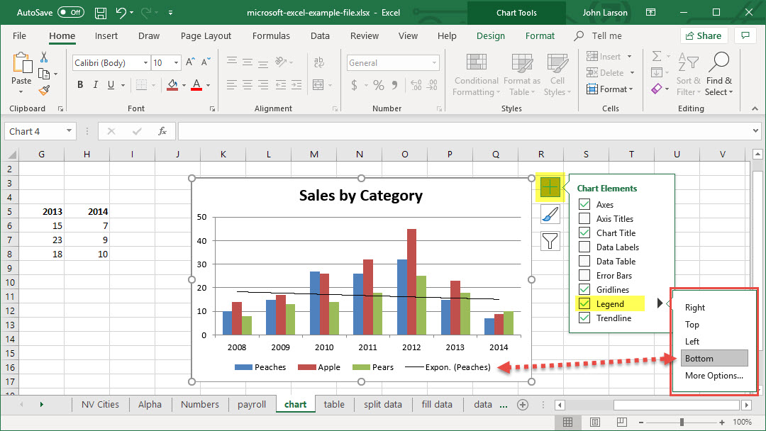
1. Select a chart and then select the plus sign.
2. Select Legend and select the arrow next to it.
3. Choose where you want the legend to appear in your chart.
4. Select OK.
Hide a chart legend
1. Select a legend to hide.
2. Press Delete.
Update the Data in an Existing Chart
If you need to change data in a chart, you can do it from its source. As you make changes in your source data, you’ll see the changes reflected in the chart.
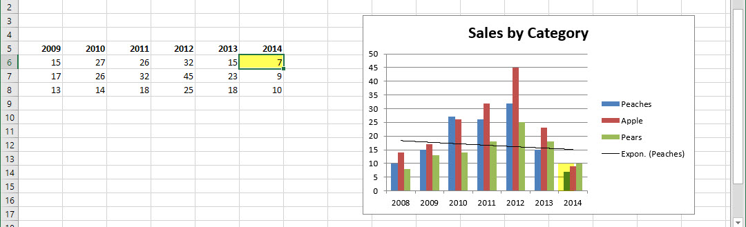
Before
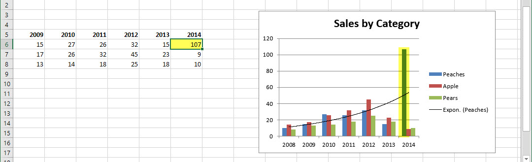
After