1. Entering Data into an Excel Spreadsheet
Open a new spreadsheet. In the first row of column B (cell B1), type “January”. Before you hit enter, click on the fill handle, fill handle is the small black box in the lower right hand corner of the highlighted cell. (Note: If the fill handle is not displayed, click Options on the Tools menu. On the Edit tab, select the Allow cell drag and drop check box) and drag to column M. Excel recognizes “January” as part of a list (the months of the year), you can use the fill handle to automatically fill in the rest of the months. It also works for days, dates and numbers.
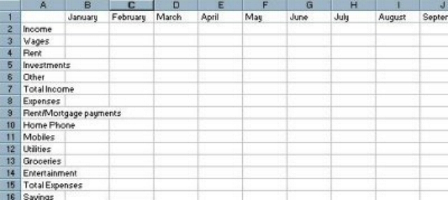
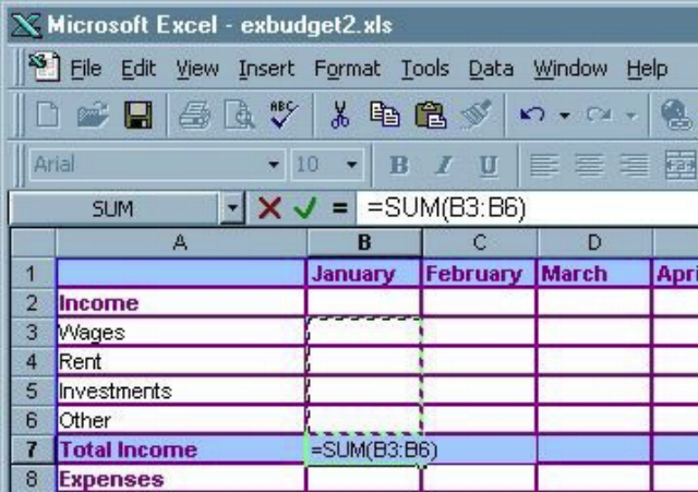
In the second row of column A (cell A2), type “Income”. Under Income, list all the types of income you receive on a monthly basis (i.e. Wages, Rental Income, Investments, etc). You can be as specific or vague as you like. After all your types of income have been entered in column A, type “Total Income” in the next cell down, followed by “Expenses” in the cell after that. List all of your expenses (i.e. Rent/Mortgage, Phone, Utilities, Groceries, etc), followed by “Total Expenses” and then finally “Savings”. Your spreadsheet should now look something like this:
You’ll notice that some of the data in the cells overlaps the edge of the cell. To fix that, select columns A to M by clicking on the “A” at the top of column A and dragging to column M. You’ll notice that between each column heading there is a line. Rest your cursor over that line and it should change into a cursor that looks like this:

When you see that cursor, double click. All of your columns should now be wide enough to accommodate the widest entry in each column.
2. How to Format a table
Select the whole budget by clicking on cell A1 and dragging across until all cells in the budget are selected. Right click on the selection and a menu will popup. Click on “Format Cells…” from that menu. A new window for formatting cells will popup with several tabs, select the “Border” tab. The first thing to do is select the type of line you want for your outside border. To do that, simply click on the line style you want. If you want to change the color of the line, use the drop down color box and choose a color. To apply the line style and color, click on the “Outline” button. Use the same process to select the line style and color for the inside borders. When you’re finished, click Okay to see the results.
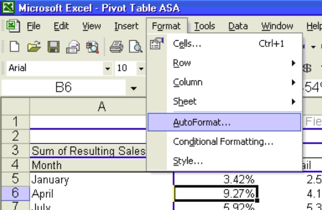
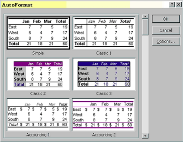
Another option is to auto-format. Select the whole chart and click format on the tool bar scroll down to auto format and left click. From this next screen you can select any format that you like from the examples.
3. Rules of Formatting
Make use of white space
White space is the blank area that surrounds the data. Strangely, having white space surrounding your data makes your data appear more prominent on the page. Whether reading the spreadsheet on screen or printing it out, good use of white space should make your spreadsheet easier to look at and reduce eye-strain.
Add borders where needed
Borders on a spreadsheet, just like borders between countries define the sections of information that belong together. It makes it much easier to see at a glance all relevant information. For example a monthly budget may be broken up with borders around each week. That way you can see the budget for the month over all, but as each week has borders around it, you can also easily see what’s happening on a weekly basis.
Pick a font and stick with it
There’s nothing worse than opening a spreadsheet and finding a hodge-podge of fonts thrown together for no particular reason. It looks unprofessional and can be quite hard to read. Pick one simple font to work with – preferably a common font that will be on any PC the spreadsheet is used on (i.e. Arial, Century Gothic or Times New Roman). Its also a good idea to choose san serif fonts (i.e. Arial) over serif fonts (Times New Roman) as they are easier to read. If your spreadsheet is for work, find out what the company preferred font is and use that exclusively. Once you’ve picked your font, feel free to
change the color and size as necessary for emphasis. Using bold for headings and italics to highlight is a good idea – but don’t go overboard.
Size 8 font isn’t a good plan
The smaller the font, the harder it is to read. While size 8 fonts might look just adorable, they’re a nightmare to read for most people – even more so for those with eye problems. This is particularly important to keep in mind if you aren’t the only person using or viewing the spreadsheet. Size 10 or even size 12 are much more user friendly.
Use the correct cell format
Correct cell formats can save a lot of time and effort. If you are planning on using a column for dates – select all the cells below the heading and format the cells as dates. Excel will then recognize anything you put in those cells as a date. So if you want the format to be 12th December 2006, all you’ll need to type in those cells is 12/12/2006 – a huge time saver.
Colors are great for emphasis
Colored Backgrounds work well with borders to distinguish headings from data, different types of sub-totals and totals, months, etc. Use caution, however, when choosing your colors – using a combination of a lime green background for headings with purple writing and eye popping red backgrounds for your data may not be the best combination. Generally, if you are going to make use of any dark colors, they should only be used for headings and you should always use a pale color for text on dark colors – white and pale grey are good for this purpose. Any color used as a background for your data should
preferably be a pale shade. Use common sense when choosing your color patterns, bad choices can make your spreadsheet down-right painful to look at. If you find you get a headache every time you open your spreadsheet, think about toning down your colors
Charts are a great addition to your spreadsheet
At a glance they can see whether profits have risen or fallen. Busy people are far more likely to look at a chart than they are to read rows and rows of data. So, add a chart to your spreadsheet.
Think inside the box, use more than one worksheet
Spreadsheets are basically boxes that are either printed on box shaped paper, or viewed on a box shaped monitor. Try to keep this in mind when designing your spreadsheet. Spreadsheets that are too wide or too long can become difficult to read. Keep that in mind when creating your next spreadsheet. So, we know spreadsheets are boxes and when they’re too long or wide it makes it difficult to view or print them. So what can you do? The simplest thing is to use more than one sheet. For example, if you have a yearly budget, split the budget up so that you have one sheet for every month and then a summary sheet that gives a running total for the year. The information is then much easier to find and process.
Column widths – be logical about it
Should all your columns be the same size? Not necessarily. But when you start designing your spreadsheet that will be the case, they will all be the same. When thinking about what size each column should be, focus on the size of the data you will be entering, not the size of the heading. Columns that will contain dates only need to be wide enough to fit in the widest date, while columns for comments may need to be quite large. Use your best judgment and remember that you can always adjust the cell format to wrap long text if necessary.
Print Preview is your friend
Print preview can find a lot of faults in your spreadsheet design before you print it out. If you’re planning on printing out your spreadsheet rather than just emailing them or viewing them on screen, you need to familiarize yourself with this feature. The printing FAQ for Excel gives more detailed information on print preview and printing.
4. Using Auto-sum
First, make sure the active cell is the cell for January’s Total Income. On the standard Excel toolbar, there’s an Auto-sum function button. The button looks like a Capital E, or a Capital M turned on its side. Click that button and you’ll notice “=SUM()” has now been entered into the active cell. This is a standard Excel function that allows you to do basic addition, subtraction, multiplication and division.
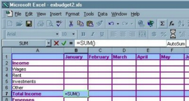
The Auto-sum feature makes adding together our income and expenses a simple process. After clicking on the auto-sum button all you need to do is select the cells needed for the addition. To select the cells that need to be added together, simply click and drag until all of the income cells for January have been selected and then hit enter.
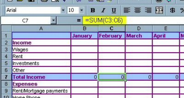
Click on the cell for January’s Total Income to make it become the active cell again. Click on the fill handle and drag across to column M. When you release the fill handle, the formula that the auto-sum feature created for January will be copied into every month. You can see that the formula has modified itself so that for February, the formula has changed to take the values from Column C (i.e. “=SUM(C3:C6)”) rather than taking the values from January’s column B. This shortcut will come in handy when using the auto-sum feature or using other formulas in large spreadsheets.
Total Expenses is calculated in the same way as Total Income. Make sure January’s Total Expenses cell is the active cell then use the Auto-sum button. You may notice that this time Excel has automatically added the cell for January’s Total Income. That happens because when Excel sees a number value in the same column it assumes that those are the numbers you want added. In this case, we don’t want that cell to be added. Instead click and drag to select all the Expenses cells for January and then hit enter. You already know how to copy the expenses formula to the other cells. Use the same process outlined as used to copy the auto-sum formula for the Income cells.
The final thing we need to do to create a working budget is to enter the formula for Savings for each month. Make sure that the cell for January’s Savings is the active cell before you continue. This time we will next to do something slightly different with the auto-sum function. We don’t want to add cells that are next to each other this time, we actually want to create a formula that will subtract one cell from another, and too complicate matters, the cells are quite far apart. We will do this process in two steps. Click the auto-sum button again. To begin to create this auto-sum, click on the cell that has the formula for the Total Income for January, then hold down the Ctrl key and click on the cell that has the formula for Total Expenses for January.
5. Inserting Functions
By clicking on the = sign or the fx sign located before the cell entry view you will come to a data base called the function wizard, that can be used to find any number of functions. Just spell the function in the search box and it will give you all related functions with their definitions.

= AVERAGE(B4:B7)
= COUNT(B4:B7)
If you know the word or phrase to begin a function you may simply put an equal sign or a plus sign to start the function in the cell. A standard function will appear “=function symbol(cell data begins: cell data ends)”
6. Graphing
Create a string of data that you want to be graphed, highlight it. Go to the Excel tool bar and click the tab: insert. Click the item chart under the subdirectory. You will come to a selection menu that looks like this:

Select the graph that best interprets your data and end objective. If you have to graph a data series over time select a line graph, if you have to compare volumes over different data series select a bar graph, etc.
Once you have selected the type of graph you need the next screen will ask you if you want to interpret your data vertically or horizontally. Most data will be examined vertically but there are some occasions where horizontal analysis is needed.
The next subdirectory gives you an opportunity to name your data sets and define the function within the graph. The name of these data sets will be the two entities you are measuring.

The final subdirectory gives you the options of where you want your graph to go within your spreadsheet, either on another worksheet or to create another worksheet all together.
7. Frequency Functions
Frequency is an unusual array function and it works differently to most other normal functions. It can not simply be typed into a cell or even entered properly using the Excel Function Wizard. Note: That this function does not analyze values into categories e.g. household expenditure into groups such as gas, electricity, water, rates etc.
7 steps to arriving at frequency:
1. Identify a range of data on which you want to perform your frequency analysis. (C5:C16)
2. Create a vertical range of cells containing the upper bandings with which you wish to group your data (i.e. 0-12, 13-16, 17-20, 21-24)
3. Highlight a vertical range of cells in which you wish the analysis to be reported (F5:F9).
Note that by extending this range by one extra cell, you can capture all values above the maximum banding (i.e. over 24).
4. With the whole destination range highlighted, type the formula. = FREQUENCY(C5:C16, E5:E8)
5. Do not press enter. This is an array function and therefore requires you to use the alternative key strokes of <Ctrl> + <Shift> + <Enter>
6. The results will then be automatically entered in all 5 cells (F5:F9). You will notice (in the formula bar) that the formula appears with curly brackets / braces ‘{}’ around it. This indicates that it is an array function. If you type the formula in a single cell and don’t enter it using the correct key combination, the function will only return the first value (i.e. 3).
7. It is not necessary to have the output range adjacent to the range of bandings. It can be placed anywhere so long as the number of cells is sufficient. You may wish to place the results directly into a table which contains narrative text versions of the bandings for display purposes. The actual range of values used to define the bandings used by the function is hidden elsewhere and need not be displayed or printed.
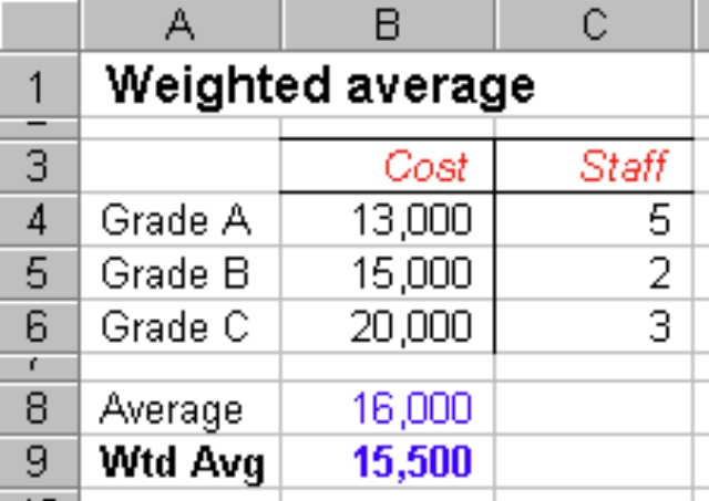
8. Weighted Averages
Excel does not contain a built in function to calculate a weighted average. It is however easy to do it using the SumProduct() function in a simple formula.
SumProduct() multiplies two arrays (or ranges) together and returns the sum of the product. In the illustration it would calculate ‘(B4 x C4) + (B5 x C5) + (B6 x C6)’. The formula in cell B9 is: = SUMPRODUCT(B4:B6, C4:C6) / SUM(C4:C6) The result shows that the weighted average is less than the plain arithmetic mean. This is because it has taken into account the larger number of staff being paid the lower salary.
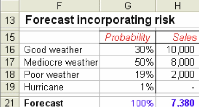
The weighted average can also be used for assessing the risk or determining the probability of various outcomes. If a judgment is made about the likelihood of various weather conditions for an outdoor sporting and the effect on ticket sales, a predicted value of sales can be calculated using a similar formula as the previous example. =SUMPRODUCT(G16:G19, H16:H19) returns the value of 7,380. The probability values (G16:G19) are already expressed as percentages (totaling 100% or 1.0) and so there is no need to divide by SUM(G16:G19).
9. IS and IF functions
These functions are easy to use and allow you to create a wide range of useful formulas. IF functions are used to compare 2 or more pieces of data and make a conclusion based on that data. For example, say you have a spreadsheet that tallies students’ grades and you need to see at a glance who passed and who failed. An IF function could easily be used to decide if the student got a grade between 0% and 50%, and failed, or whether they got above 50% and passed. That’s just one example of how the IF function could be used. You can also use the IF function to create more complex formulas.
Assume:
From $1 to $10 earns 10% commission
From $11 to $100 earns 15% commission
Anything over $100 earns 20% commission
Assuming the amount of sales is in column B, starting at row 4, and that the column containing the commission is formatted for percentages, this is what the nested IF function would look like:
=IF(B4<=10,”10″, if(b4<=100, “15”, “20”))
This nested IF function says that if the cell B4 is less than or equal to 10, then put “10” in this cell (the commission), if the cell B4 is greater than 10, but less than or equal to 100, then put 15 in this cell. If the number in cell B4 is greater than 100, then put 20 in this cell.
IS functions are closely related to IF functions. Generally an IS function allows you to replace an expected result with another, more user-friendly result. For example the ISERROR replaces Excel’s standard, ugly errors (such as #VALUE!) with messages of your own design. There are also IS functions to allow you to decide what happens if a cell is blank, if a cell contains text or if it contains a number.
10. Paste Special
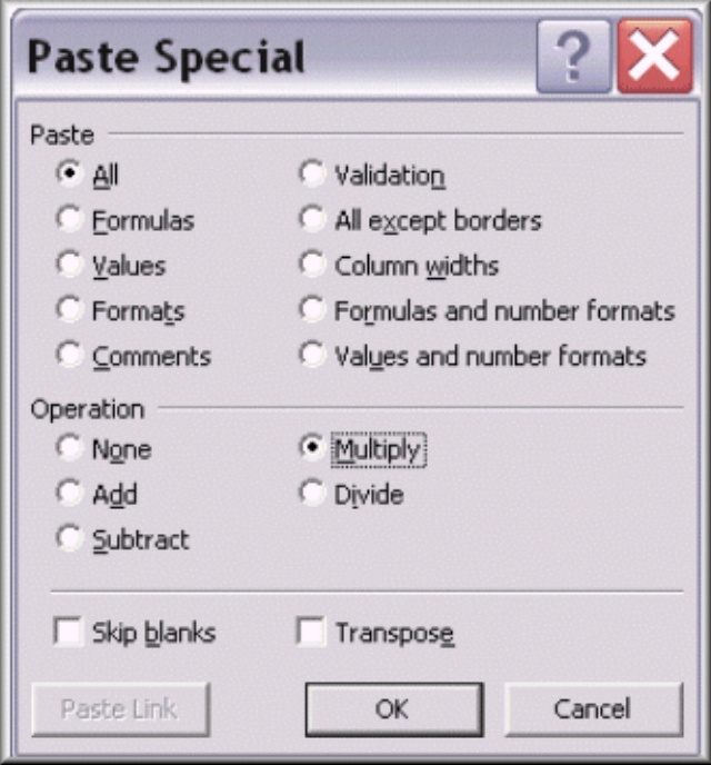
Using paste special can be very beneficial if you have to copy formulas from one row or column to another. You would copy the cells just the same; however you would paste the cells using paste special which gives you the option of pasting just the values or just the formulas.
 There is a lot to learn in Excel. We’ve covered some of the basics and you should now be able to perform most of the basic functions that will help you accomplish 80% of your tasks using the program. To get you moving in the right direction, I recommend you continue to “Part 2” – 10 essential things you should know about Microsoft Excel. These are quick lessons to help you further your abilities or clarify what you’ve already learned.